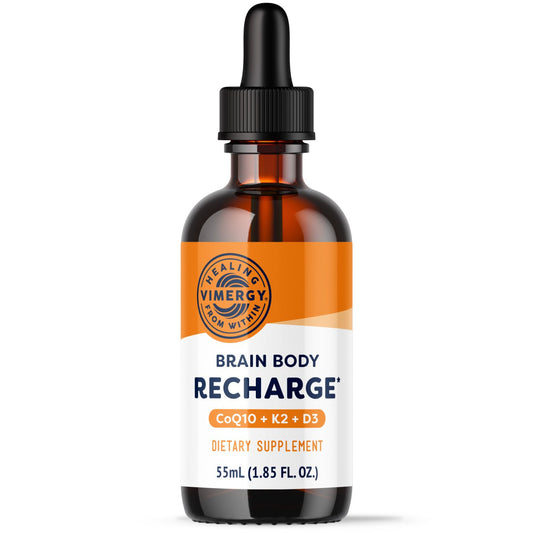
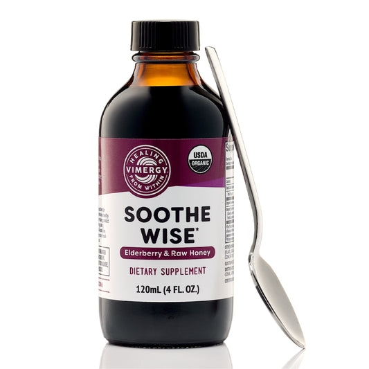
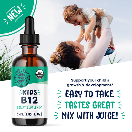
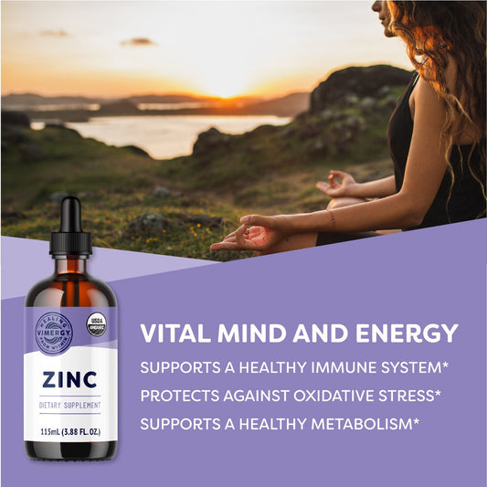
Big changes are happening at Vimergy.
We’ve always stood for purity, potency, timeless ingredients and unmatched integrity. Now, our brand reflects this more than ever.
Like our fast-absorbing vitamin drops, our updated identity delivers results with clarity, strength and impact.
This isn’t just a new look. It’s a new era.
SYMBOLS OF STRENGTH
BEHIND OUR NEW LOGO
It’s more than a design. It’s a declaration. A standard of unwavering quality and uncompromising standards. It symbolizes one thing above all else: we deliver results.
OUR NEW WORDMARK
It draws on the power of heritage, reflecting the integrity and purpose behind every Vimergy product. Every detail is carefully designed to help us push the boundaries of what’s possible.
Both are enhanced by the spiritual force of "Vimergetic" Orange, a color with an unstoppable dynamic and limitless hope, embodying the vim and energy our community wants.
These new brand elements go beyond just looking different. They’re built upon a rock-solid foundation. A bold new identity inspiring you to take bold new steps on your health journey.
INSPIRED BY HERITAGE & INNOVATION
The Vimergy Logo: A modern emblem drawn from apothecary symbols and scientific precision—where tradition meets progress.
The Vimergy Wordmark: A fusion of archival apothecary bottles, bold typography, and the raw power of liquid itself.
This resonates more than a rebrand. This is the next chapter.
A NEW WAY FORWARD
Our bold new look is more than a transformation. It’s a reflection of our shared strength, commitment and purpose. When you have the right support in place, feeling unstoppable isn’t just possible. It’s inevitable.
The new Vimergy is here.

